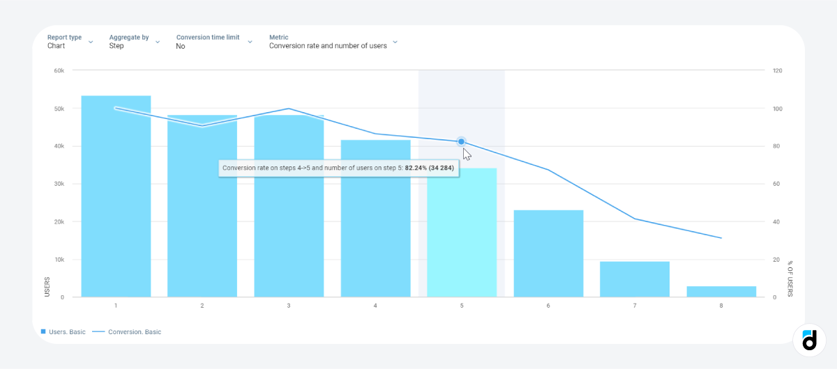
Devtodev’s clients frequently create funnels to analyze various aspects of their apps and games. However, these funnels are often longer than a single screen, and the users find themselves having to scroll excessively, which can be quite inconvenient.
To alleviate this issue, we have recently introduced the 'Step' option to the Conversion funnel report. It is designed to save our clients time and effort while streamlining the funnel exploration process.
What does it Look Like?
This new option aggregates the data, leading to a more concise visual representation of funnel steps. This focused view highlights essential information while omitting intricate parameters and names.

How to Make Use of This View?
The 'Step' option proves particularly useful for funnels containing 20-30 steps. For instance:
-
Tracking all user actions leading up to an 'AHA-moment'.
-
Monitoring the entire user journey from registration to item receipt, including actions like inputting payment details, adding items to the cart, finalizing the order, and more.
Experience the efficiency and clarity of our enhanced funnel visualization, tailored to accommodate even the most intricate user pathways!
Stay tuned for more updates!