
Devtodev helps you upgrade your data visualization experience by adding a new feature to our reports.
About an Update
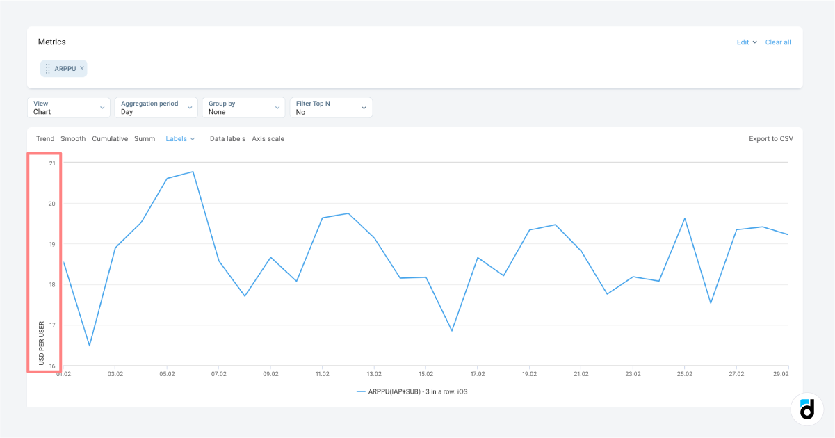
Our linear, bar, and area charts now display with dynamic scaling by default. This means that the axes are automatically scaled so that the graph is centered. This feature applies to Basic Metrics, Custom Events, and Conversion Funnel reports, except for the SQL, where users have full customization freedom.
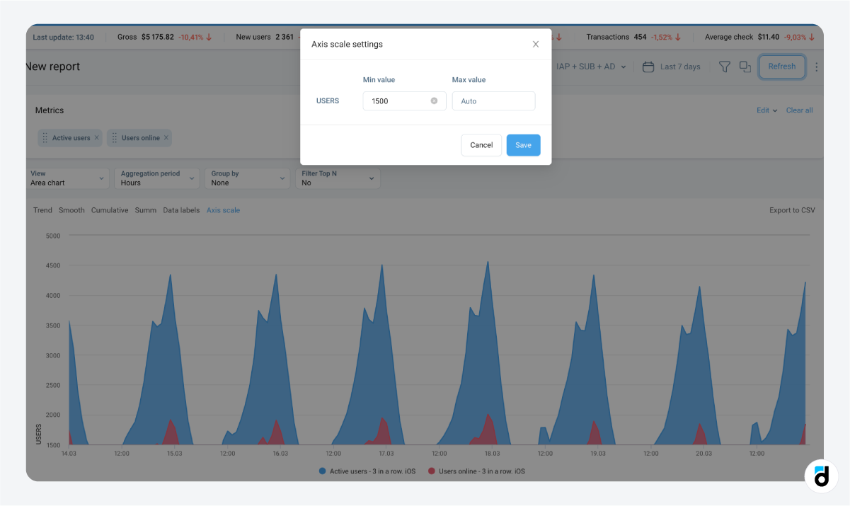
Additionally, users now are able to customize axis boundaries on their charts to more accurately represent data trends. In cases where the charts are not optimally positioned (or you are not happy with their placement, or want to change the position of the chart), simply clicking on the Axis Scale option allows you to define the minimum and maximum values for the axis. If you want to return to the default settings, simply delete these values.
Why is it Impotant?
This feature is especially useful for identifying unusual patterns in metrics and digging deeper into graphs, as well as increasing the accuracy and clarity of your data analysis process.
Stay tuned for more updates!